Chrome DevTools —features you may not be aware of (part II)

Recently I was asked about the tool I cannot imagine my work without. And my response was almost immediate — Chrome DevTools. For those who don’t know that (is it possible to never hear about it when you are a web developer?) Chrome Dev Tools are a set of super useful and powerful instruments for developers available for free and built-in Chrome browser. Some time ago I wrote an article describing 5 less known features hidden in Chrome DevTools (you can read it here) but definitely, there are many more! It’s why I decided to write the next part of the article and describe 3 new features. Did you know all of them? Let’s check!
CSS Overview
CSS Overview is a Preview feature — it means the Google team is still working on this part and collecting the feedback. However, even in this early stage is super useful. It’s just a summary of all styles applied on the webpage with tips on how to improve it and the possibility to locate all affected elements in the Elements panel. How to generate this report?
- Open the Chrome browser
- Navigate to the page you want to test
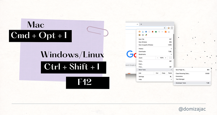
- Open Chrome DevTools (ctrl + shift + I on Linux/Windows or cmd + shift + I on Mac)
- Click 3 dots in the right top corner to open the menu
- Choose More tools > CSS Overview
- Click the
Capture overviewbutton

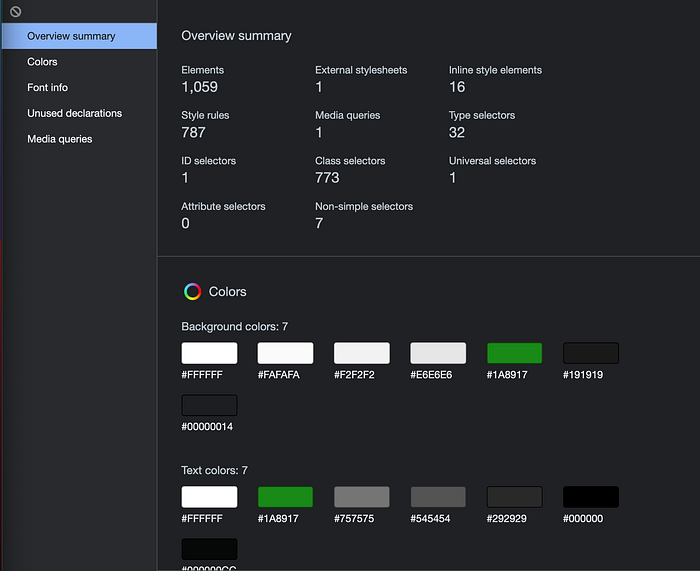
After a few seconds, you’ll receive a report similar to this visible on the screenshot with 5 sections: Overview summary, Colors, Font info, Unused declarations, and Media queries. Each section is quite self-explanatory so I won’t describe them in detail and just mention the most important stuff. The first of them (Overview summary) provides us some stats — number of class selectors, external stylesheets, elements, etc. The second one (Colors) is more interesting — presents the whole color palette used on the page. When you see something incorrect (e.g. using incorrect color) you can click on the given color and receive a list of all elements using this color. Each element on the list is also clickable and will redirect you to the Elements tab where you can check details and fix problems. What is more, in this section you can also see all elements with the insufficient color contrast ratio between text and its background (instruction on how to fix it is in the next section). Similarly, you can receive a list of all elements using given font, media query, or unused declaration. What a great way to overview the style of your webpage and improve it, don’t you think?
Finding and fixing problems with an insufficient color contrast ratio
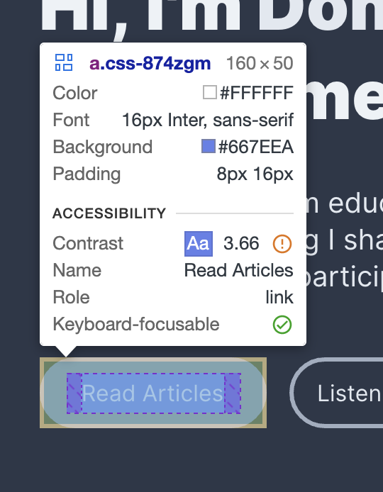
If you read my previous articles you know I’m a huge fan of accessibility — making web pages available for everyone. One of the most popular problems I see on the Internet is the insufficient color contrast ratio between text and its background. Why it’s problematic? Because people with e.g. color blindness may have difficulties with reading the text. Fortunately, those problems are quite easy to detect with automated tools e.g. via Lighthouse audits (I wrote about them here) or CSS Overview I described in the previous section. But not everyone knows that Chrome DevTools can not only help to find the problematic place but also fix the issue. Just take a look at the example below.

In the picture, you can see a button with an insufficient color contrast ratio between text and background. You can recognize it by taking a look at the Accessibility section of the tooltip and seeing the orange exclamation mark icon close to the contrast value. So, we know that there is a problem with the element but how to fix that?

- Open Chrome DevTools
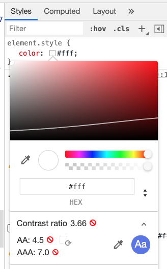
- Choose the blue arrow in the
Elementstab and choose the element you want to fix on the page - Take a look at
Stylesthe tab of the selected item - Click the color preview square next to the color value to open the color picker
- Click the arrow next to
Contrast ratiolabel to extend the section - Click
Refreshbutton close to the red icons (depends on the standard you want to fit do it in line with the AA label or both of them) - The new color value — fulfilling contrast criteria and as close to the original one as possible will be presented in color input.
Trust me - describing that that is much more difficult than applying. Just open Chrome DevTools and check it yourself!
Recorder tab
The recorder tab is the next feature in the Preview mode. Thanks to that you can easily record and replay user flow on the webpage and avoid arduous manual work. You can also add/edit/remove steps and measure the performance of a given user flow (an extremely important factor if you want to keep users on your page). What’s more — created flow can be exported as Puppeteer script and used in your CI/CD. Extremely nice! How to generate this script?
- Open the Chrome browser
- Go to the page you want to test
- Open Chrome DevTools
- Click 3 dots to open the menu
- Click More tools > Recorder
- Click the
Start new recordingbutton - Add recording name and optionally selector attribute (e.g. data-testid, data-cy, etc)
- Click
Start a new recordingbutton - Perform actions you want to record
- Click
End recordingwhen you ready
After a while, you’ll receive a timeline similar to this visible on the screenshot below.

You can replay it, edit, add or remove steps, etc. UI is intuitive and I’m sure you’ll know what to do so I’ll skip detailed descriptions. As I said previously you can also export it to use outside of DevTools or share it with others. What I like is the Measure performance option. To run it just click the blue button in the top right corner. Thanks to that you’ll receive a full performance report on a given flow — with screenshots, stats, event stacks, etc — everything you need to make your webpage faster and easier to use. Don’t take my word for it — just check it out! It takes just a few minutes.
Summary
Of course, the list is not exhausted — there are many more useful features hidden in Chrome DevTools. I just tried to choose the less-known and the most interesting /useful at the same time. Let me know if you knew all of them! I hope, you’ll find them helpful in your work. Happy coding!
PS. If you found this article interesting please leave some claps and comments, or share it with your friends. Thanks in advance!


